Start with a small palette you will actually use
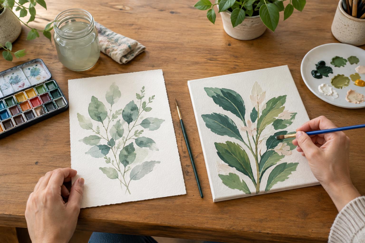
A large paint set can look inviting, but more tubes do not necessarily make mixing easier. When you are learning, a few familiar colors give you a better chance to notice what each one does. Choose paints made for the same medium, such as all acrylics or all watercolors, and begin with a yellow, a red or magenta, a blue or cyan, and white if your medium calls for it. You can add an earth color, such as a brown, if you often paint natural subjects.
The names of paint colors are only a starting point. Two tubes labeled “red” may produce very different oranges and purples because their pigments lean in different directions. If you already own a few colors, use those before shopping for an ideal starter set. A limited palette is not a promise that every vivid color will be possible; it is a manageable way to learn which mixtures you can make.
Mix in small steps, not large guesses
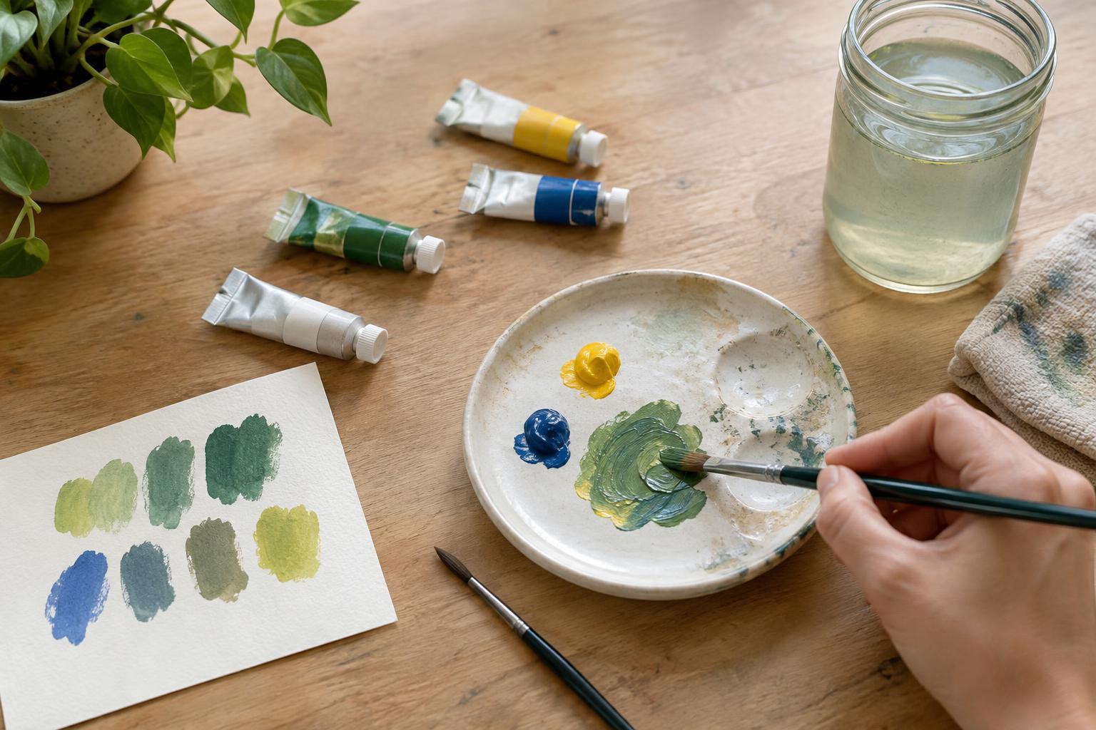
Put out modest amounts of paint and use a separate area of your palette for each new mixture. Start with the lighter or less powerful color, then add the stronger color a little at a time. For example, add a touch of blue to yellow when exploring greens. It is easier to deepen a mixture than to rescue a large puddle that has become too dark.
Make a simple mixing chart when you have a spare half hour. Mix each pair of your main colors, moving from mostly one color to mostly the other, and paint a small swatch of each step. Label the paints you used. The chart will show you the greens, oranges, purples, and muted in-between shades your particular tubes can produce. Let the swatches dry before judging them, since some paints change appearance as they dry.
Adjust lightness and intensity separately
When a color looks wrong, ask two questions before adding more paint: Is it too light or dark? Is it too bright or dull? Treating those as separate problems makes the next move clearer. White usually lightens an opaque paint mixture, though it can also make a vivid color look softer. With watercolor, adding more water generally makes a lighter wash on white paper; it does not work like adding white paint.
To soften a color that is too intense, try a tiny amount of a color from the opposite side of the color wheel: red with green, blue with orange, or yellow with purple. This often makes a useful muted shade, but too much can turn the mixture muddy. To darken a color, test a small amount of a darker paint already on your palette. Black can be useful, but it may shift the character of a mixture more than you expect.
Mix for the picture, not for a perfect formula
Instead of trying to match a named color such as “sage” or “terracotta,” compare your mixture with what you want to paint. Is the green in a plant warmer or cooler than the green you have made? Does the wall behind it need to be quieter so the leaves stand out? Small comparisons are often more helpful than a fixed recipe, especially because colors can appear different beside their neighbors.
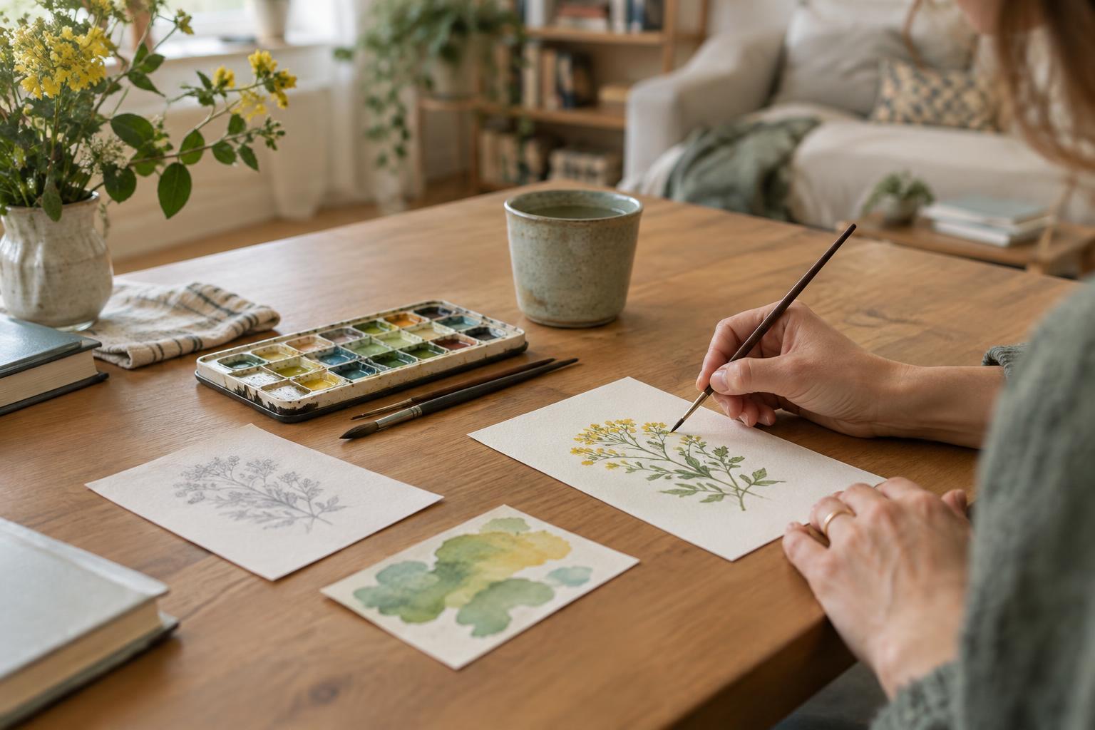
Mix a little more than you think you need for a broad area, since an exact match can be hard to recreate. For smaller details, use tiny batches so you do not waste paint. If a mixture surprises you in a good way, paint a swatch in a notebook and write down the colors and approximate proportions. You do not need precise measurements; a note like “mostly yellow, little blue, touch of red” may be enough to get close next time.
Keep the practice easy to repeat
A small setup removes much of the friction from painting. Keep your chosen tubes, a palette, brushes, scrap paper, and a cloth together. Use a clean brush or mixing tool when reaching into another color so the original paint stays usable. Check the cleanup instructions for your medium, and keep paint tools separate from anything used to prepare food.
If a mixture becomes muddy, do not treat it as a failed session. Set it aside as a possible shadow or background color, clean a space on the palette, and try again with smaller additions. Over time, repeating these simple tests will tell you more about your paints than a crowded box of colors you rarely open.