Start with what is on your desk
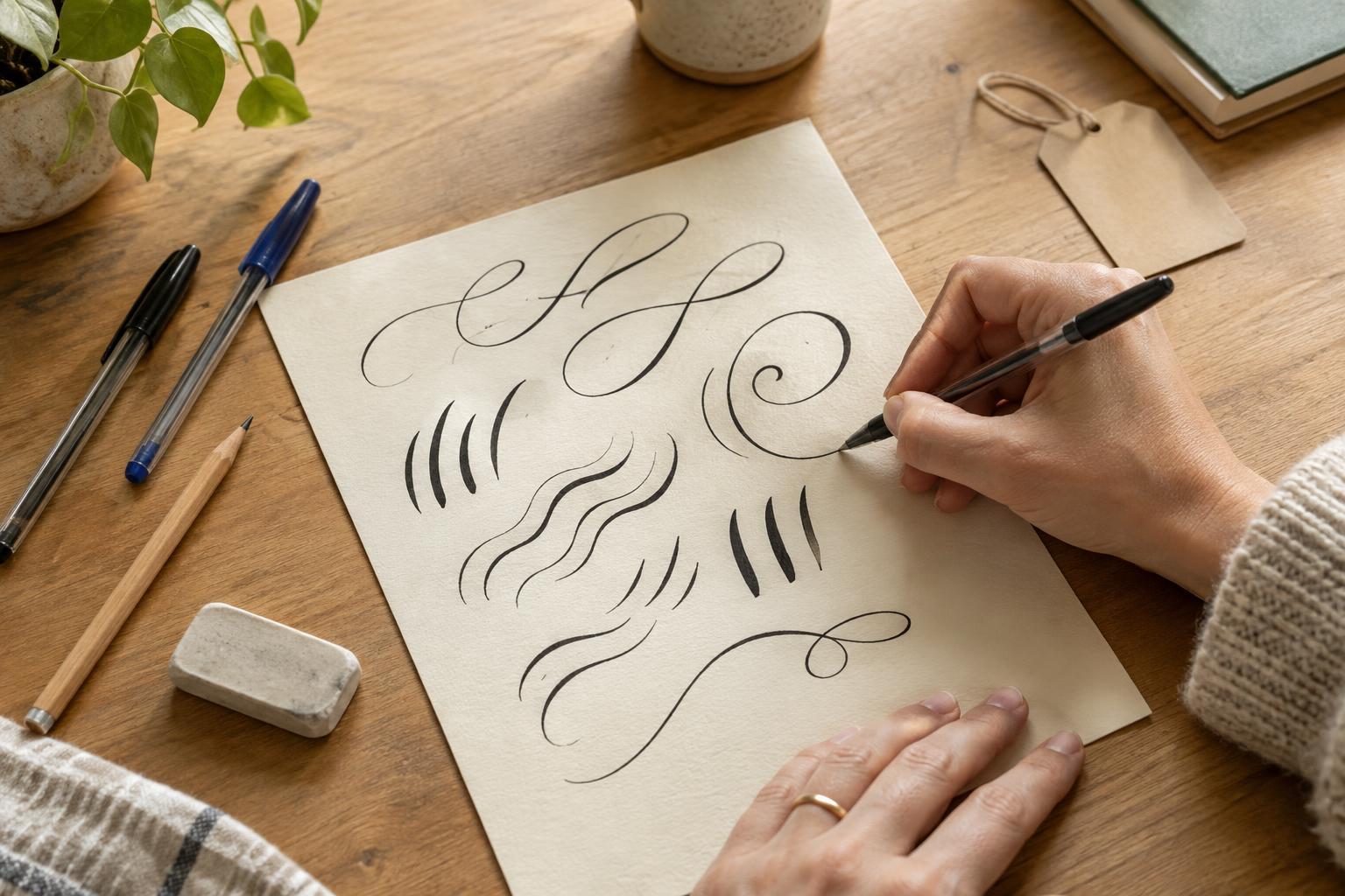
Hand lettering is the practice of drawing letters deliberately rather than simply writing them at your usual speed. That shift in pace matters more than the pen you choose. A ballpoint, gel pen or fine-tip marker is enough to begin. Each will make a slightly different line, so pick one that feels comfortable and works reliably on the paper you have.
Keep your first setup simple: a pen, a pencil, an eraser and a few sheets of paper. Smooth paper can make it easier to draw steady curves, but notebook paper is fine for practice. If your ink tends to bleed through, put a spare sheet underneath. Try not to judge a pen by how impressive it looks; the best beginner tool is one you are happy to use repeatedly.
Learn to see letters as shapes
Ordinary handwriting runs together because your hand already knows where it is going. For lettering, slow down and notice the pieces. A lowercase a, for example, can be built from an oval and a short line. Many other letters share familiar parts: straight stems, rounded bowls, arches and tails. Draw a row of simple shapes before attempting a whole word.
Next, choose one style to explore. Rounded lowercase letters are a friendly starting point because they leave room for small variations. Write the same short word several times, changing just one feature: make the letters wider, raise the middle of the word or add a gentle slant. Keeping most features steady helps you see what each change does. Uneven results are useful information, not a reason to start over.
Try faux calligraphy with a regular pen
A brush pen changes line width as you press and release, but you can suggest that contrast with any pen. Write a word in a loose cursive or connected style. Then look for the downstrokes: the parts of each letter your hand drew while moving downward. Add a second line beside each downstroke and fill in the narrow space between the lines. This is often called faux calligraphy.
The trick is to work slowly enough to keep the added width fairly consistent. You do not need to thicken every line; leaving the upward strokes thin creates the contrast. Start with a short word such as hello so you can concentrate on the curves. If the ink smears when you fill a shape, give the first line a moment to dry. You can also leave the outlined spaces unfilled for a lighter look.
Make spacing part of the design
An appealing word can still be hard to read if its letters crowd each other. Before using ink on a card or label, sketch the word lightly in pencil. Mark its beginning, middle and end so you can judge whether it will fit. Leave a little room between letters that lean toward each other, and step back to check the word as a whole. Optical balance is often more useful than measuring every gap.
For a short phrase, decide which word should catch the eye first. You might letter that word larger and write the others in simple print. Limit yourself to one or two styles on a small page; this gives the phrase a clear shape without making it busy. A penciled guide for the top and bottom of the letters can help them sit together, even when you choose a playful, imperfect style.
Finish one small, useful project
Practice feels more rewarding when it has a purpose. Choose a gift tag, a notebook cover or a label for a box. Keep the message brief, draft it in pencil and then trace it with your everyday pen. If you want decoration, add a small border, a few dots or a simple leaf shape. Let the letters remain the focus.
Save your first attempt, even if you make another version. It gives you something concrete to compare with later practice. When you have a spare few minutes, fill a line with one letterform or redraw a favorite word. Over time, you may notice which shapes you enjoy making and develop a style that feels like yours. The point is not to produce perfect lettering on demand; it is to make ordinary words a little more personal.