Start with the home you have
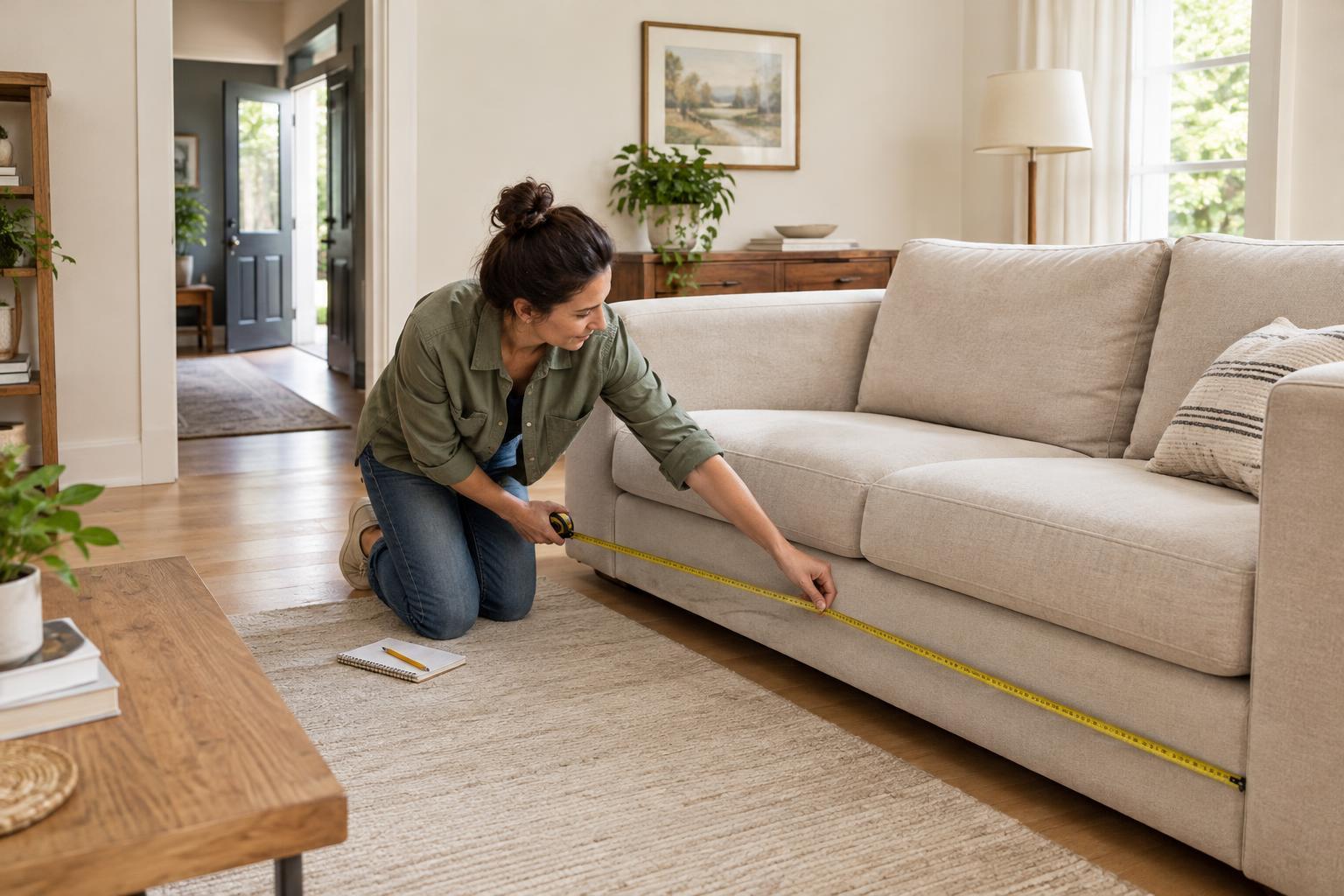
Before browsing paint colors, look at the things you are unlikely to change soon: flooring, countertops, large furniture, tile and window coverings. These surfaces already contribute color to a room, even if they seem neutral. A warm wood floor, for example, may look different beside a cool gray than it does beside a soft cream. Working with these existing pieces is usually easier than trying to make them disappear.
Notice which colors appear more than once in your home and which objects you genuinely like. A patterned rug, a favorite chair or a piece of art can be a useful starting point. You do not have to pull every color from it. Choose one or two that you would be happy to see in several places, then note any strong existing tones your palette needs to accommodate.
Choose a small set of colors with different jobs
A simple palette might include a main neutral, a supporting color and one or two accents. The main neutral creates a quiet background on larger surfaces such as walls or curtains. The supporting color adds character through upholstery, bedding or a smaller painted area. Accents are the easiest to change: think cushions, lamps, artwork or table linens. These are roles, not strict rules; a room can feel cohesive without following a fixed formula.
Try describing the mood you want before choosing exact shades. “Warm and relaxed” might lead you toward cream, muted green and terracotta. “Light and calm” could suggest off-white, soft blue and natural wood tones. Keep your description close to how you want to live in the space, rather than a look you feel obliged to copy. If two colors both appeal to you but compete when placed together, let one take a smaller role.
Pay attention to undertones and light
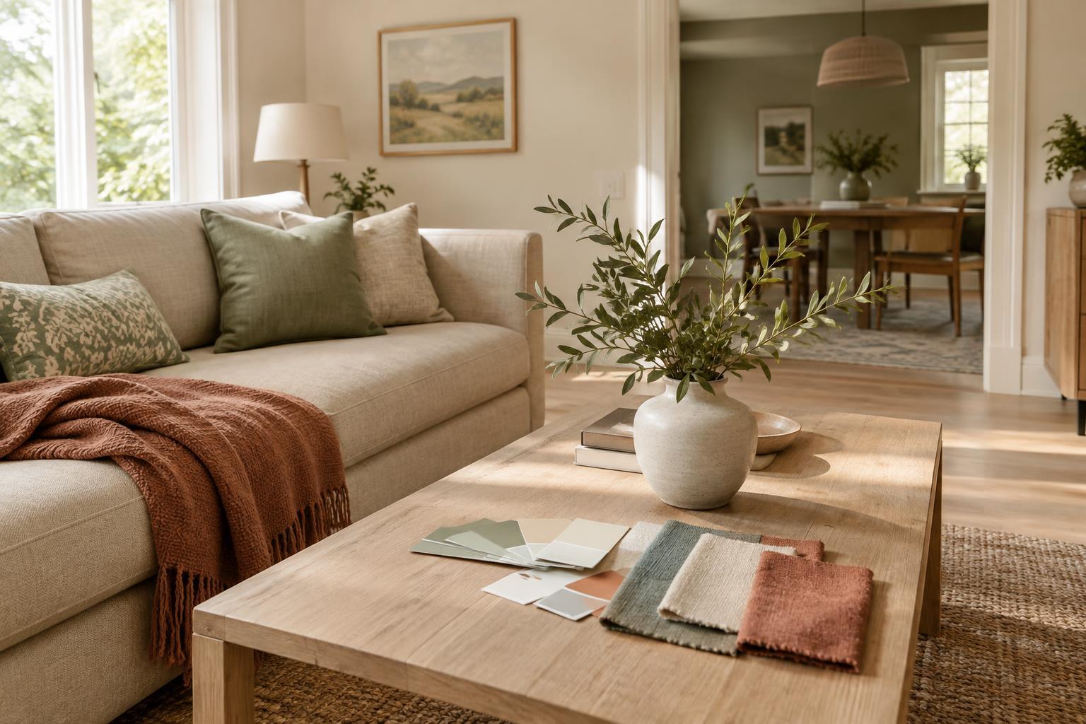
Colors that look similar on a screen or in a shop can feel quite different at home. Whites may lean creamy, pink or blue; grays may have green or violet undertones. You do not need to name every undertone perfectly. Put possible colors beside your floor, sofa or tile and ask whether they look comfortable together. Comparing samples side by side is often more helpful than judging each one alone.
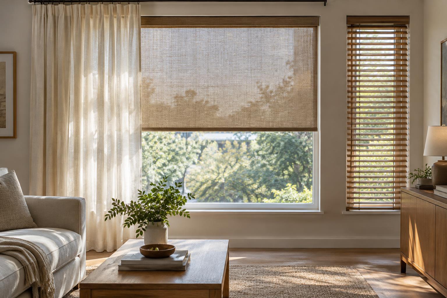
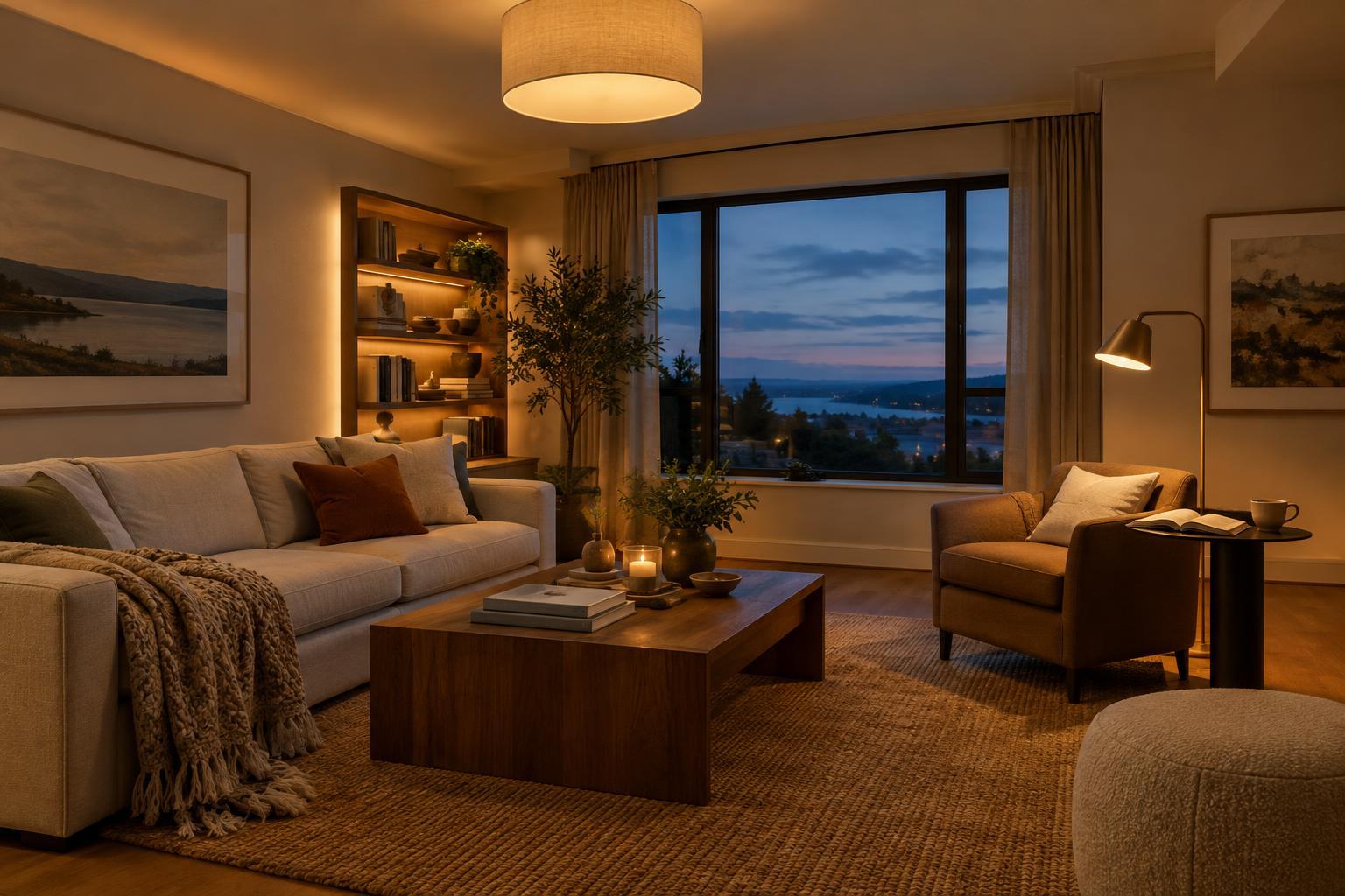
Light can also change how a color appears through the day. If you are considering paint, place sample cards or test patches on more than one wall and look at them in morning, afternoon and evening light. Check them under the lamps you normally use, too. For textiles, bring swatches into the room when possible. Taking time here can prevent a color that seemed gentle in isolation from feeling unexpectedly bright or dull across a larger surface.
Connect rooms without making them identical
A whole-home palette should provide a sense of continuity, not a requirement that every room use the same three colors. One approach is to repeat your main neutral across shared spaces, then vary the supporting colors from room to room. Another is to let a favorite accent appear in small ways throughout the home: blue in a living-room print, for instance, and again in a bedroom throw.
Doorways offer a useful check. Stand where you can see into the next room and notice whether the colors feel comfortable together. Rooms can still have distinct moods. A bedroom might use a quieter version of a color that appears more boldly in a living area. Repetition of materials, such as wood, woven fibers or a metal finish, can help connect spaces even when their wall colors differ.
Test the palette with small changes first
You can explore a palette without repainting the whole home. Rearrange pieces you already own, move a lamp or cushion between rooms, or try a new cover on one pillow. These small experiments reveal which colors you enjoy living with, not just looking at briefly. They are especially useful if you rent or want to make changes gradually.
Once you have a direction, keep a simple record of your chosen colors or samples when shopping. It can help you distinguish between an item that fits your plan and one that only looks appealing on its own. Leave room for personal pieces and occasional surprises: a cohesive home is not a perfectly matched set. It is a space where the larger choices work together and the details still feel like yours.